Biggby Rebrand
visual Identity, layout, publication
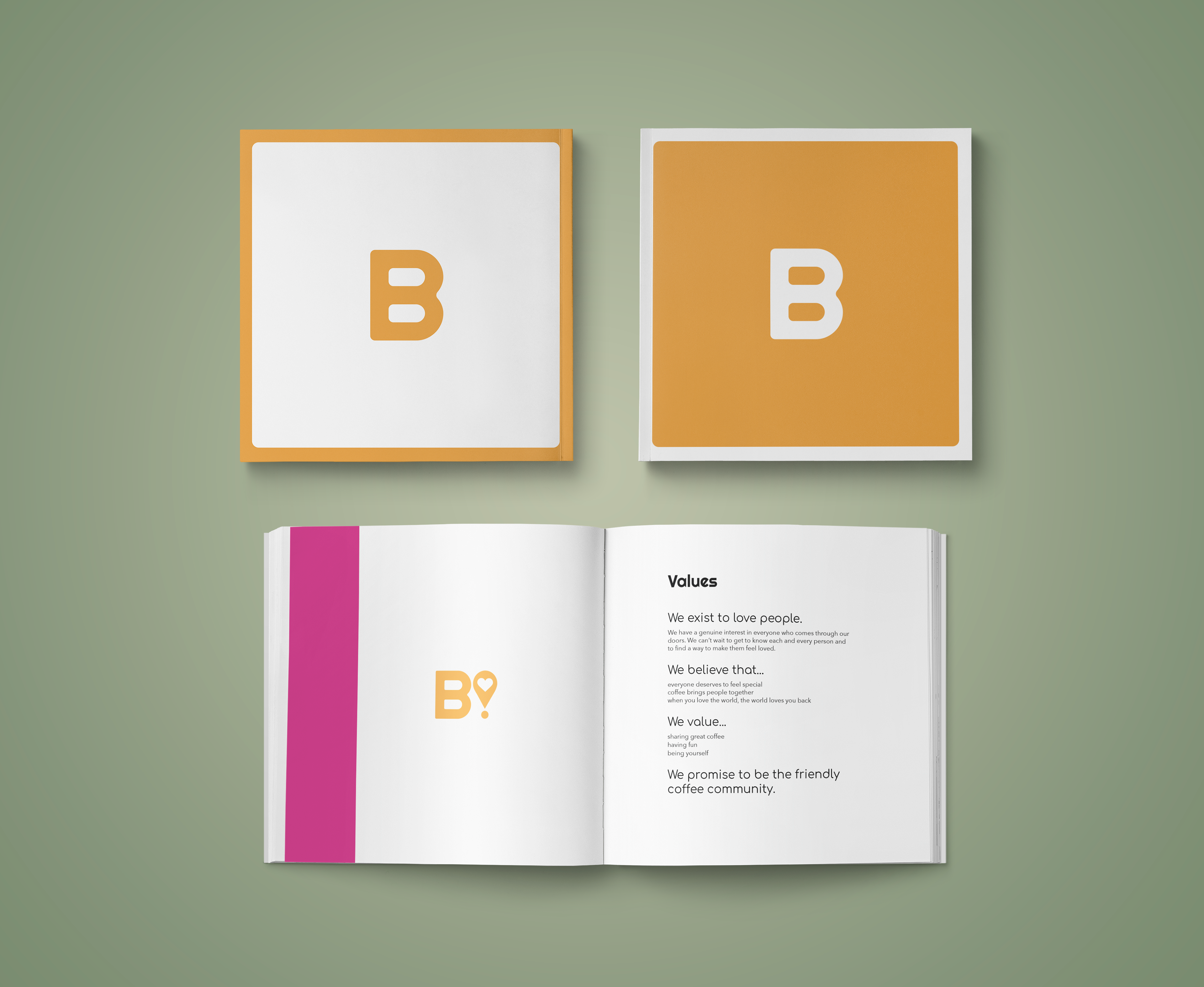
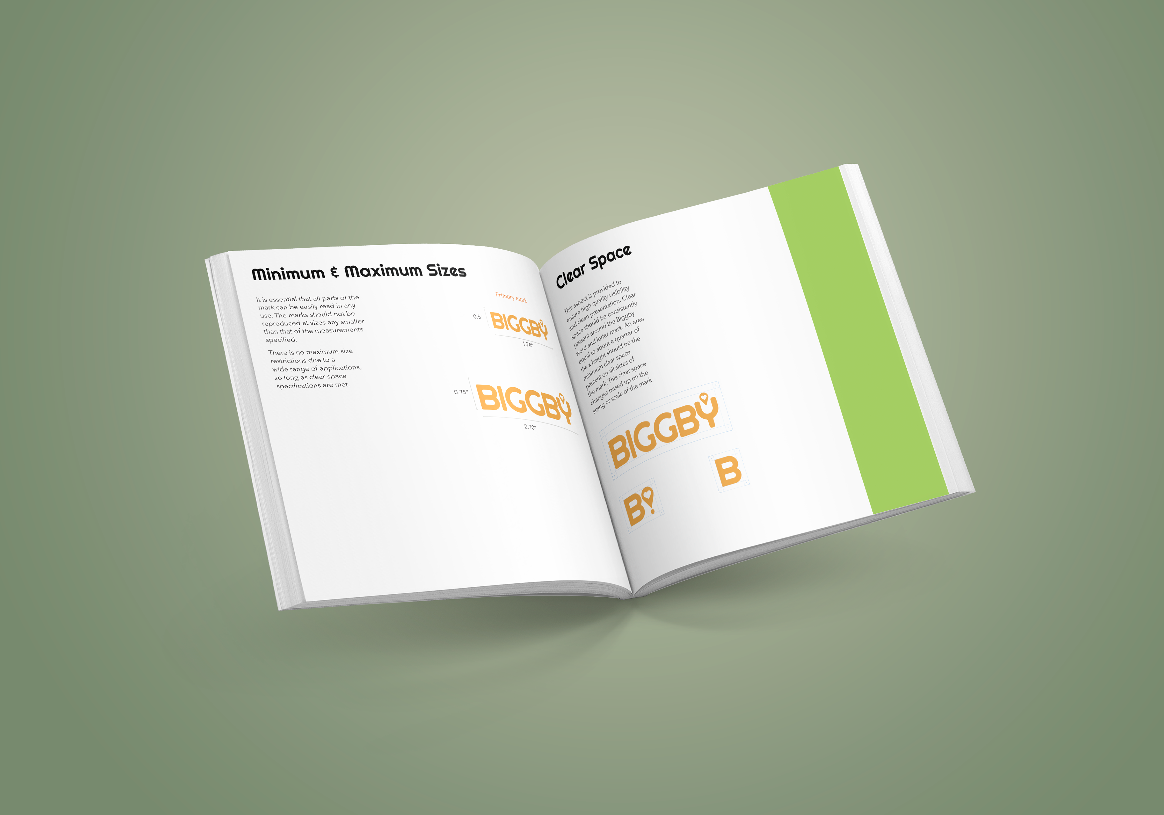
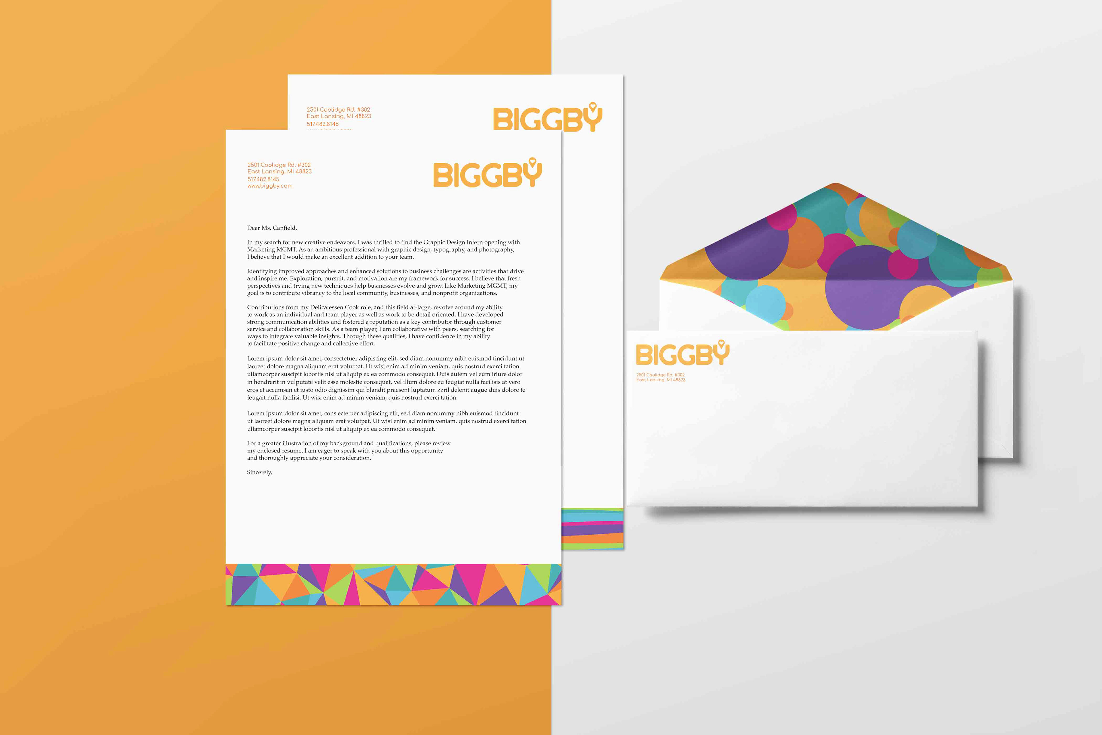
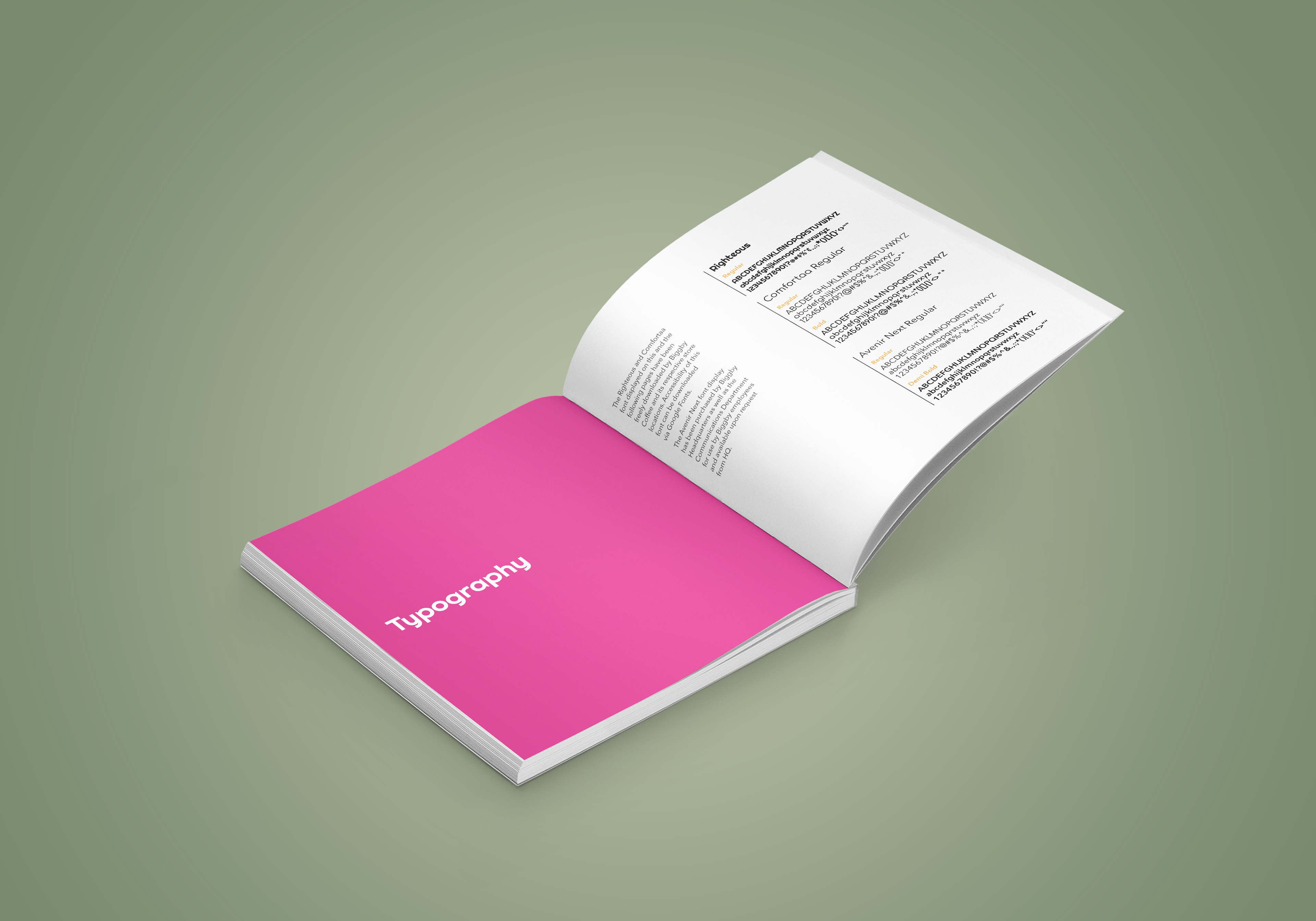
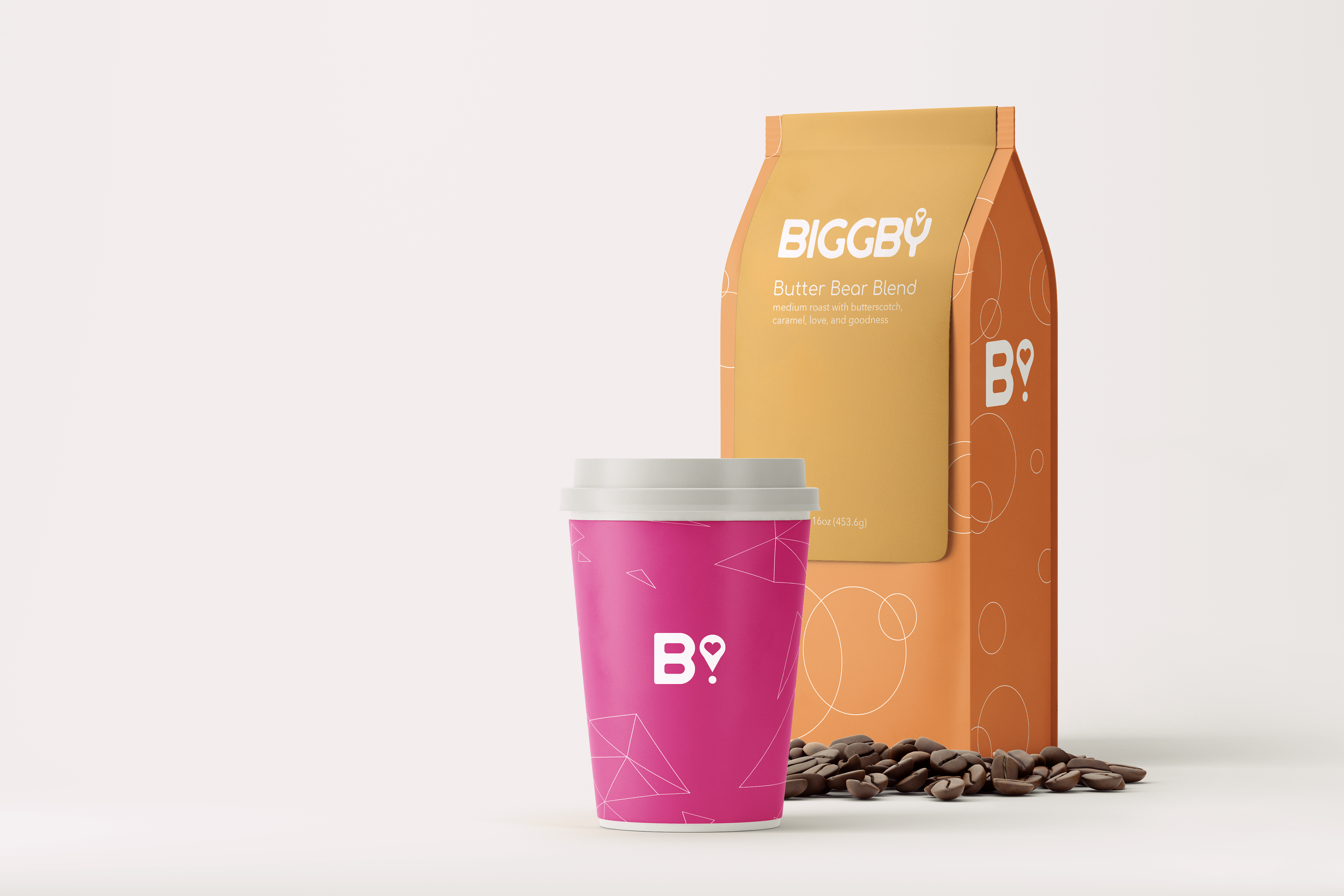
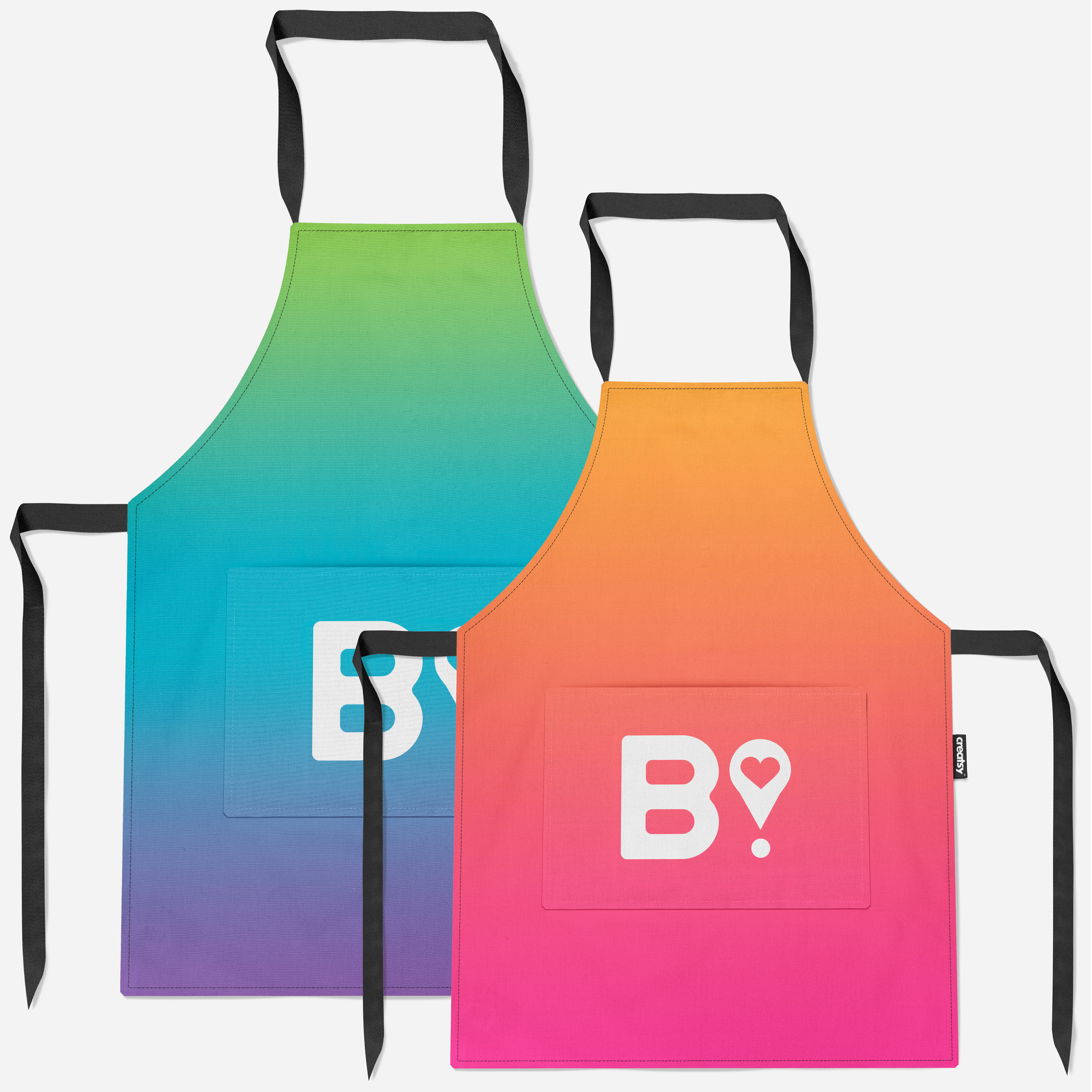
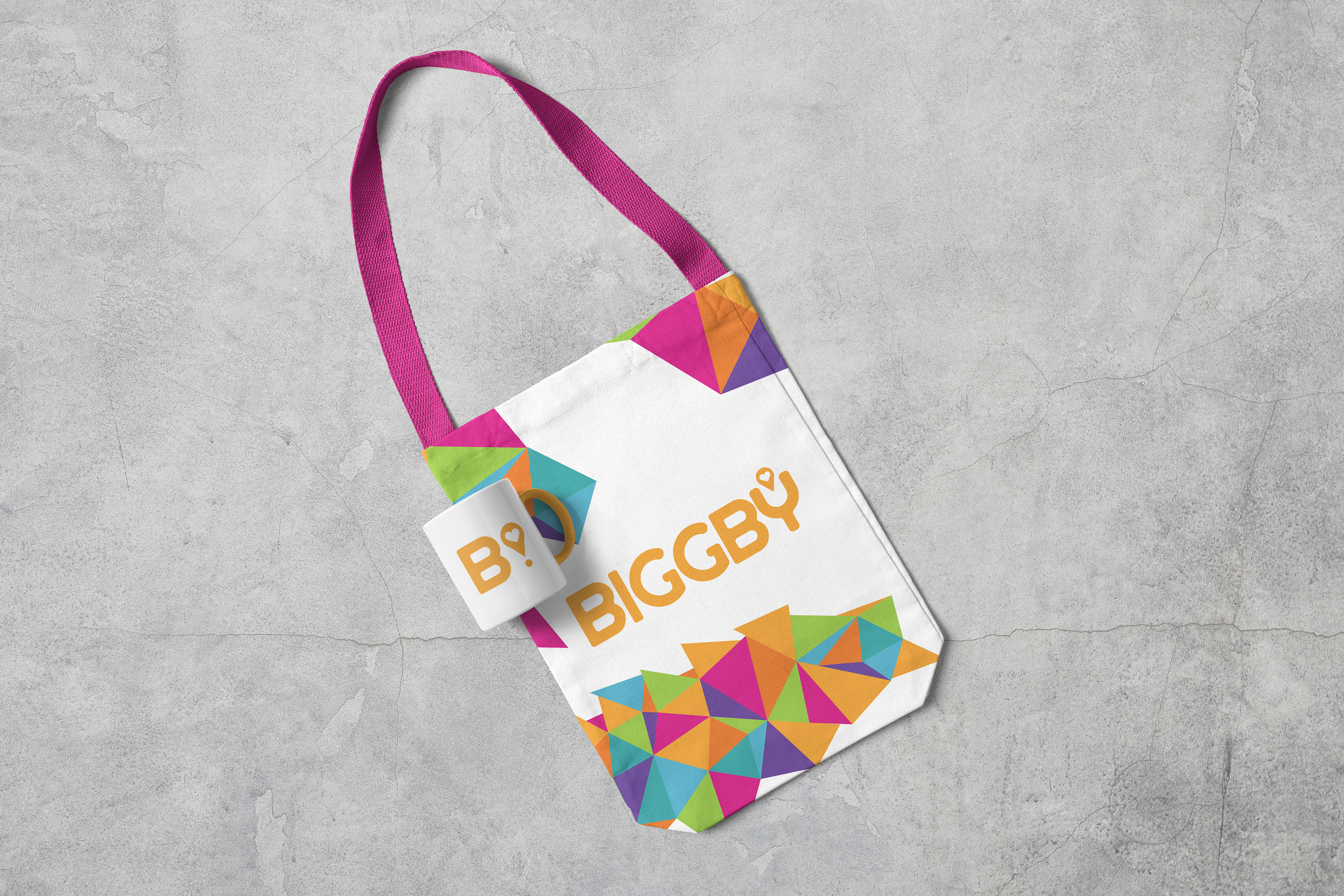
The focus of this composition began as choosing an existing company that aligns with your own beliefs and could also use updating. Biggby Coffee is a place I often frequent. The coffee and environment are warming. Biggby focuses upon the company community and local community it builds. They have a strong existing color palette that is quite vibrant, welcoming, and quirky. However, I felt the current logo and word mark used felt dated and inconsistent. The use of a sharp-edged 'B' in a box with a very rounded Arial-like font that spells out 'BIGGBY COFFEE' in all caps, felt condensed, stifled, and inconsistent. As follows is also a first-time creation and highlights of a brand manual.